In today’s world, most music buffs are searching online first for information on their favorite artists. The Internet has also proven to be a popular discovery tool, giving new and emerging artists an opportunity to lure new fans and followers with their digital assets.
Unfortunately, some websites are a never-ending maze, with dead-end roads and confusing stops along the way. Visitors can easily get lost, meaning less attention for your songs and touring schedules. As an artist, building a better website is important for maximizing your visibility and developing a strong online presence. In the coming weeks, we’ll hone in on each of the following components to provide further tips and techniques on how to deliver a first-rate visitor experience on your artist website.

Home Pages
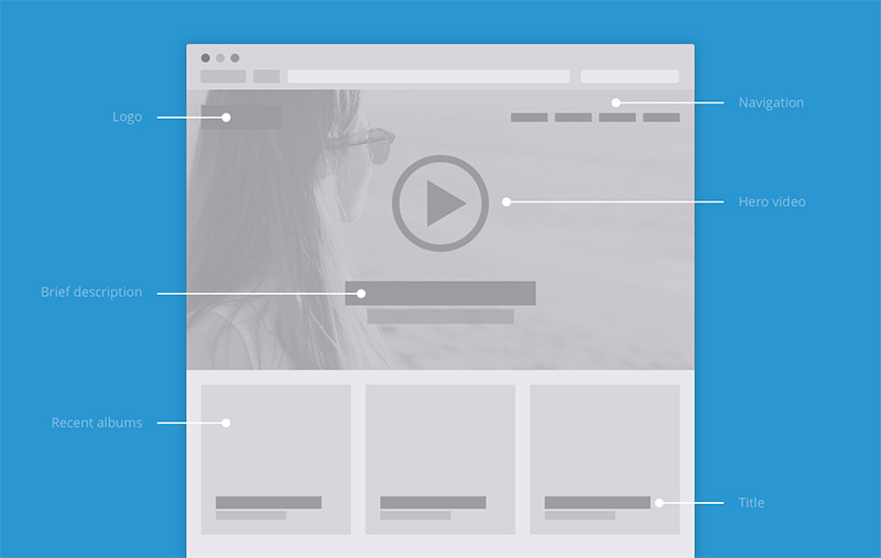
Many artist websites contain overloaded home pages with social-networking links, music players, media files and more. The visitor winds up rooting around for the information most relevant to their interests. By presenting content in a cohesive unit, you can prevent individual facets of your site from competing for the visitor’s attention. When in doubt, go with a clean and simple design. The best interface design will look clutter-free and not feel claustrophobic to the reader. Design a space that will accommodate all of the important details about how to engage with you and your music.
Splash Pages
A splash page is a single web page that will appear in response to clicking on an online advertisement or search result. Many designers lean heavily on the splash page – complete with an “enter site” message – when promoting new music from an artist. This makes sense when the designer includes a “new site coming soon” headline. However, most splash pages clash with the previous artwork, causing disconnect for the visitor. A common mistake among designers is to create a splash page with a different design than the rest of the site. Any confusion about the artist’s intent could persuade the visitor not to take action and browse further.
Site Navigation
Site navigation must be simple and straightforward in order to attract visitors and keep them coming back. First-time visitors to your site should know who you are and what your music is all about. To make the visitor’s experience more enjoyable, primary site navigation is best delivered at the top of the page. Most artist sites will feature full-screen backgrounds, large photos of the artist and massive amounts of color to make a visual impact for visitors. That’s all well and good, but don’t forget the bigger picture. Include tour dates, biography, a blog, song samples, tour dates and information on how to purchase or download music. Sites that lack these simple basics won’t attract visitors for long.
Visual Elements
Keep image sizes as small as possible. Although technological advancements have improved site capabilities, many people still have slower Internet connections. Long download times can send visitors away from your site. Photoshop and other digital imaging programs will allow you to reduce image sizes without sacrificing quality. Avoid complex visuals, special effects, plug-ins and other elements that may take a significant amount of time to load or even require new software.
Browser Compatibility
The site should have a clean finish, organized in an attractive and visual manner while highlighting the most important features. Your site should be viewable in Firefox, Safari, Google Chrome and Internet Explorer. Test your website in all major browsers before taking it public. Otherwise, it can look terrific on one browser and terrible on another.
Your site exists for entertainment purposes and should be aesthetically pleasing. Although web designers may encourage you try a number of special effects, they’re generally unnecessary for your efforts. If they’ve traveled this far, visitors aren’t nearly as interested in your designer’s technical skills as they are your music. Above all else, give your current and prospective fans a good look before they listen.
