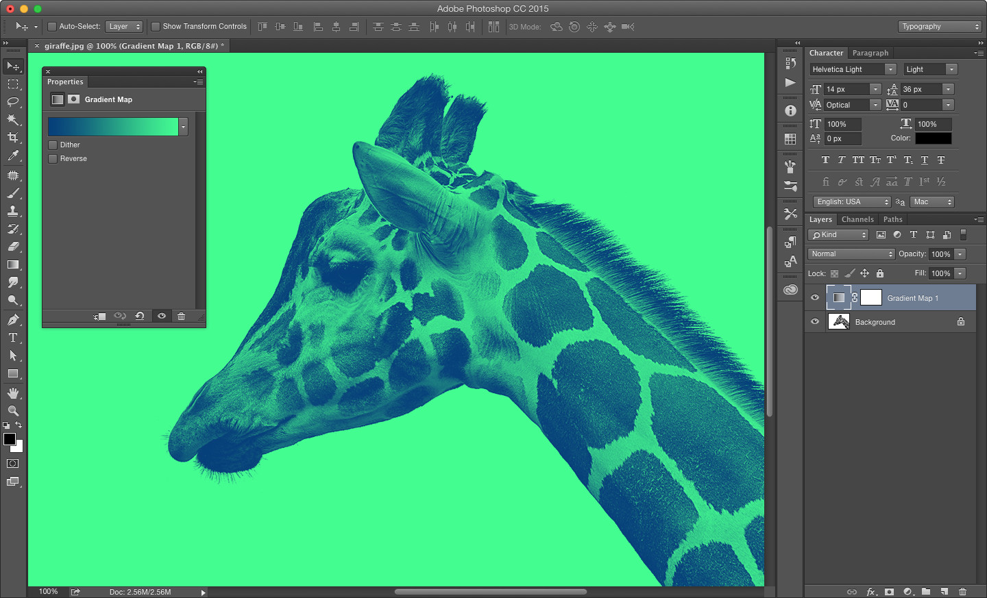
We recently released a new theme that features a cool duotone effect to make header images standout in the demo. Even cooler than the effect is how easy it is to achieve with gradient maps in Photoshop.
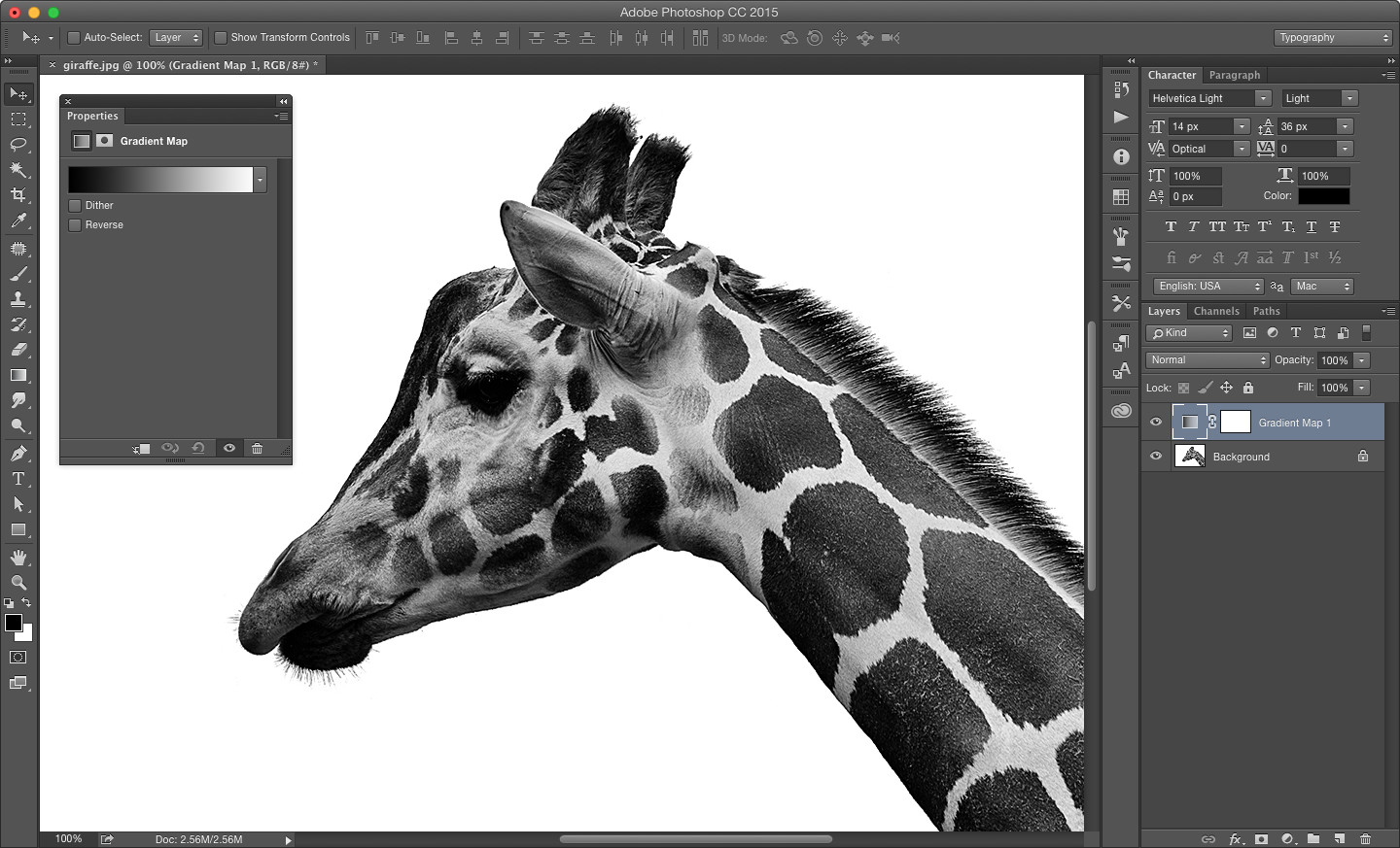
Gradient maps are one of my favorite methods for changing the dynamic of an image. To understand how they work, let’s look at a black and white image of a giraffe from Unsplash.
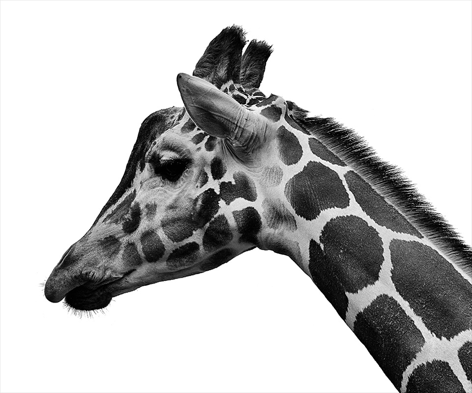
In the image above, black is considered one endpoint and white is another endpoint — all the gray tones are gradations between the two. With gradient maps, you’re simply changing the color of the endpoints. It’s helpful to remember that black and white contrast, so choosing colors that contrast will usually produce a better duotone effect when selecting your endpoints.
To apply a gradient map in Photoshop, click the adjustment layer icon ( ![]() ) in your layer panel and select Gradient Map. The adjustment layer should be positioned above your image.
) in your layer panel and select Gradient Map. The adjustment layer should be positioned above your image.
Click the gradient in your Properties panel to bring up the Gradient Editor (If your Properties panel doesn’t automatically open, double click the layer thumbnail on your adjustment layer or go to Window > Properties).
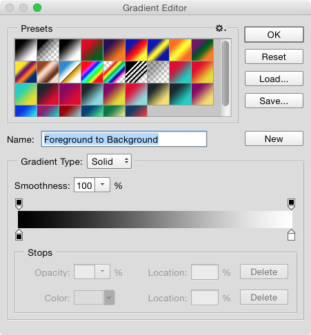
Select the lower left endpoint, then click the color swatch at the bottom to bring up the Color Picker.
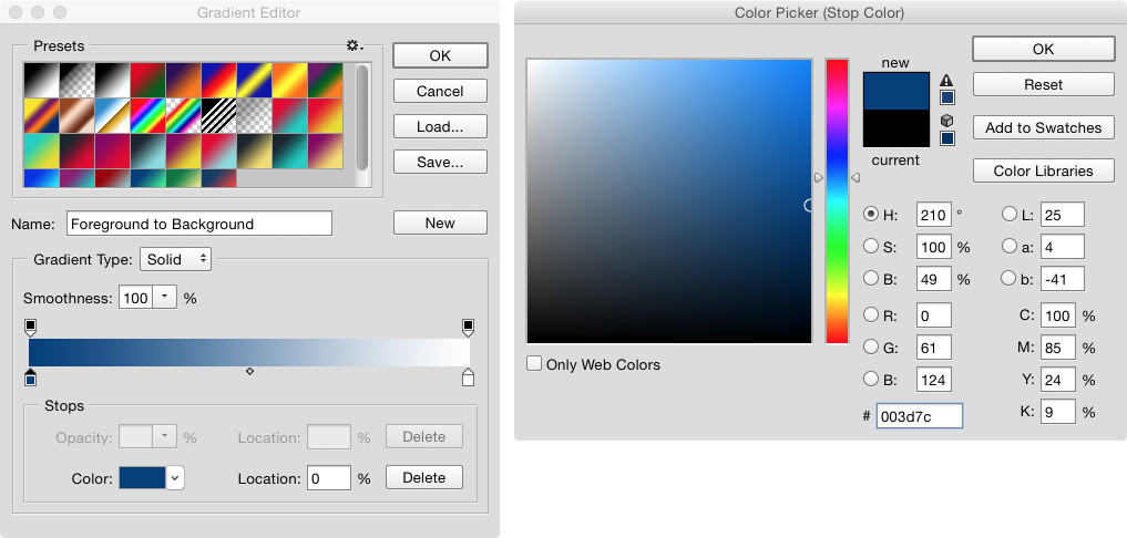
This will let you choose a color to replace the shadows in your image. I’m using #003d7c for my example. After you choose your color, click OK and select the lower right endpoint on the right side of your Gradient Editor. Click the color swatch again to bring up the Color Picker.
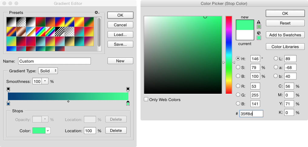
This color will replace the highlights in your image. I’m using #35ff8d for my example. Click OK to set your color, then click OK in the Gradient Editor to set your gradient map.
Because I replaced black with a blue color, all of the shadows use a blue tone, and because I replaced white with a seafoam green, all of the highlights use a green tone — including the image background, which started out solid white.
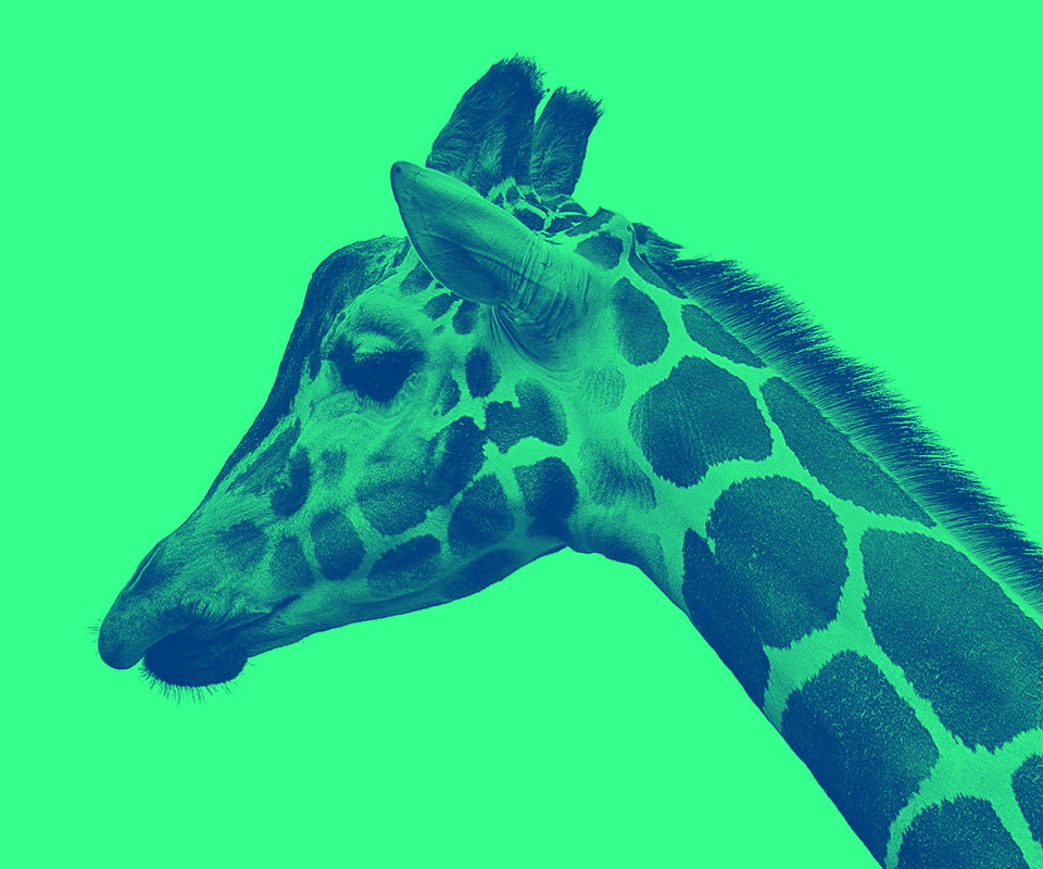
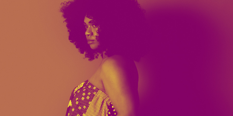
That’s pretty much it. Experiment with colors to create all kinds of cool duotone effects — and don’t limit yourself to giraffes.
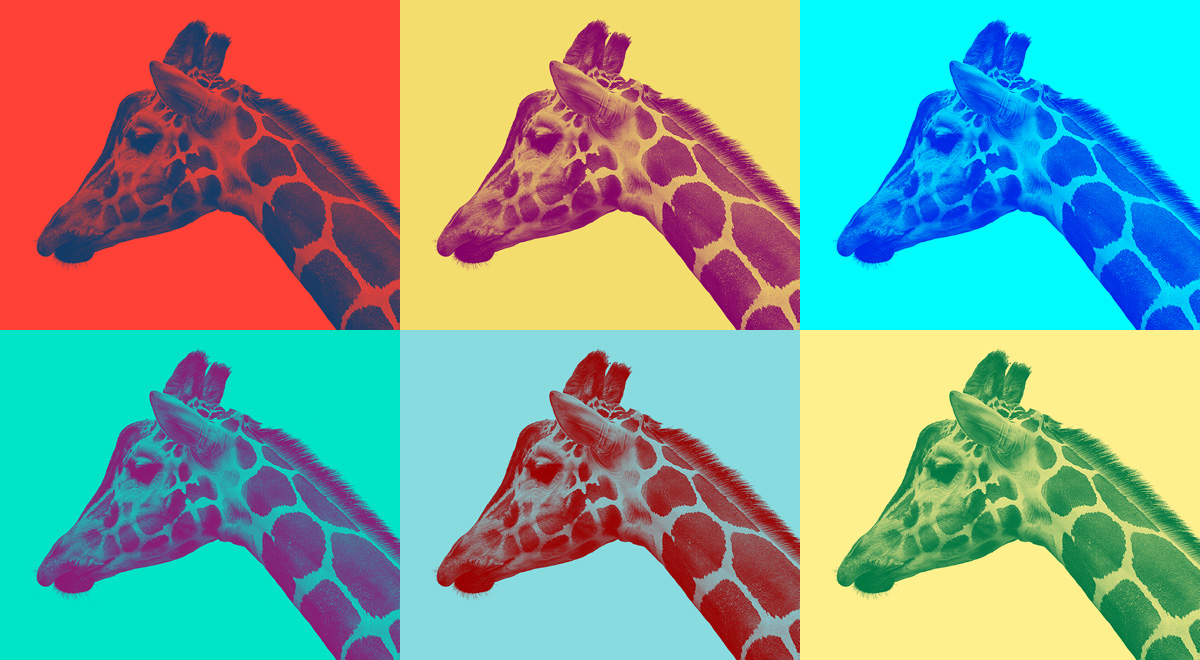
If you need help choosing colors, these are some nice resources:
Helpful tip: Add a Brightness/Contrast or Levels adjustment layer below your gradient map to boost or soften the shadows and highlights in your image.
Wao this Gradient Maps technique is amazing I have ever seen. Thanks to share, I made a map in 3d technique, it’s different idea also.
Brody sir, Thanks for sharing the steps!
Thanks